Saturday, July 30, 2011

Cards to sell


I have always had the intention of creating cards to sell. I have done a few for kindy fundraising and for my husbands work. Now that I am ahead on the cards I make to give I have starting trying different things and am starting to think about how I will put the whole selling thing together.

My last stamp club purchase was the baby tees wheel so I had a play with some baby cards. I can see I am going to have some fun with this one.

Colours: blushing bride, pear pizzaz, white, black
Stamps: baby tees wheel and whimsical words (SU), tiny tags (PTI)
Finsihing touches: in colour ribbon, hearts and stamps die (cuttlebug), button, linen thread, faux stitching

Keeping it simple


I have been having a huge clean out of all my papers and punching and diecutting all my bits and pieces of scraps for easy use in my scrapbooking. I found a number of bits and pieces that I wanted to try using for some more simple cards. Amazing what a line or two can add to a sentiment for a different design element paired with designer series paper.

Colours: night of navy, old olive, tempting turquoise, basic black
Stamps: whimsical words and birthday whimsy (SU)
Finishing touches: DSP (SU)

Out of my colour zone


The latest promo for Stampin Up is a bundle of ribbon and buttons. I had to have a play. Not a colour combo that first comes to mind. Not entirely sure that I got it how I wanted but I had a chance to play with my new Papertrey Ink set text style backgrounds.

Colours: daffodil delight, melon mambo, pacific point'
Stamps: party punch (SU), text style (PTI)
Finishing touches: ice cream parlour buttons and ribbon, designer label punch

Tuesday, July 19, 2011

Time for some pages


With everyone in holiday mode for the next two weeks we quickly get into a routine of sleep ins and staying up later at night. Its great for spending time with the boys but not so much for getting creative. So having made a number of cards I was keen to put together some pages. Heres where I love digital pages. My favourites are of everyday moments that I manage to capture. I have been making a point this year to write down the details of what we do in my diary. Even better when I put the story together with the photos.

The elements I have used were from the Jessica Sprague blog hop that I played along with recently.

Thanks to a special teacher


I still remember my first teacher. Next term Kyran is heading into a new year one class that has been created as more new entrants start in his old one. So I wanted to send a card for his first teacher. He has had a super start to his schooling and always enjoys what he has been doing. Full credit to her hard work and creative ideas.

I saw a school themed card on Nichole Heady's blog from Papertrey ink {you need to scroll down as it is in the middle of the post}. Having my new library ledger set made it easy to create the same look. I matched it up with some school papers from K&I Memories and found some great little details to finish it off. I am loving the rickrack border die.

Colours: old olive, cherry cobbler, basic black
Stamps: mini scrapbook series library ledger (PTI), all year fun and lots of thoughts (SU)
Finishing touches: school days paper (K&I memories), rickrack border die (PTI), stamps and typewriter alpha dies (cuttlebug), cork, brad

Label inspiration


A new top that my husband bought recently caught my eye as an idea for a card. Mainly the label as though you think it is inside out but, thats the design otherwise the label is on the outside! So I took the stripes and added the embossing using the argyle folder from cuttlebug to give it a bit more of a knitted look. Then I added the stitched label. Rather simple.

Colours: basic grey and black
Stamps: vintage labels (SU), alpha (unknown)
Finishing touches: argyle and pop culture embossing folders (cuttlebug), stitching

Wednesday, July 13, 2011

July Stamp Club


The challenge for this month was a pop up card. I started by looking on google and came up with some great ideas. It was when I was reading a pop up story to one of the boys that I decided to try out one that had a picture that moved up and down. After putting together the different parts I had some trouble getting it to sit right and ended up putting it together in the centre. Still pops up. I think I will stick to the less complicated.

Needing a card for a farewell at my husbands work gave the theme for the card. As I haven't used my sock monkey stamp set it gave a great start for the pop up image. As I usually put the details on the outside of the card I had fun putting together different papers patterns. Although as a stamp club challenge it is focused on Stampin Up products, I couldn't resist using my new stamps from Papertrey Ink to make a background to pull all the colours together. Looking forward to having more of a play with the rest. And after seeing the Christmas card using the new hanging out stamp set by Nichole at Capture the Moment I had to try putting together the postmark sentiment.

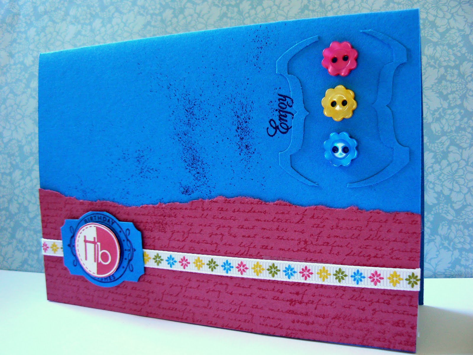
Colours: white, bravo burgandy, basic grey, blushing bride
Stamps: sock monkey and more monkey accessories, background sampler, whimsical words and itty bitty pieces (SU), a little argyle and tiny tags (papertrey), all about me (kaiser)
Finishing touches: bitty buttons, blushing bride stitched ribbon and DSP (SU), upper crest border punch (fiskars), stitching, white embossing powder.

Sunday, July 10, 2011

Seeing the world through a cardmakers eyes


Wherever I am now I am inspired to recreate colour combinations and images of what I see. The inspiration for these cards came while doing my hair, of all things. What if I used the same design elements and changed out the words for birthday sentiments. I recently purchased a creme coloured embossing powder that was perfect for the job. Love how it turned out. Will be checking out the other colour combinations that they use for more ideas.

Colours: wild wasabi, certainly celery, very vanilla, handsome hunter
Stamps: happy birthday (kaiser), inspired by nature, circle of friendship and lots of thoughts (SU), alpha (martha stewart)
Finishing touches: brown sugar embossing powder (american crafts)

Inspired by design


I love the combination of black, red and white. I definitely can't wear red so I enjoy using it in my cards. As red is a common colour in advertising I seem to see ideas everywhere that I want to use. I teamed up the simple sentiment with an embellishment made from felt. The stars finished it off.

Colours: black, shite, cherry cobbler
Stamps: happy birthday (kaiser)
Finsihing touches: white embossing powder, felt, star punches, stitching

Saturday, July 9, 2011

Learnt to crochet


On my last visit with Mum I had a chance to learn how to crochet. WIth the basic steps and how to follow a pattern I was able to make flowers. So I have been having a play with different wool. Different thicknesses give different sizes.
Because the flower is the focus there wasn't much more to add. I made a cream flower to go with the twill tape. The colour strip was inspired by a card from Nichole Heady for the papertrey ink blog hop which you can see here. I am looking forward to using more of my new found skill.
Colours: very vanilla, riding hood red, certainly celery, tangerine tango, chocolate chip, baja breeze
Stamps: vintage labels
Finishing touches: twill tape, crochet flower, button, stitching, linen thread

Trying something new


I have seen this bootprint image on a store in town and thought it would make a great stamp so wanted to have a play. I tried to 'stamp' using the print from one of my son's shoe but it was too big, so found an image on the computer to use instead. I added the embossed foil as a technique that I wanted to try with the diamond plate cuttlebug embossing plate {a bit more industrial}. Having just taken a drive around the coast I was also inspired to make some signs to add to it. Definitely need to have more of a play as it didn't turn out quite how I pictured it. Always love a challenge to use what I have to create something I have seen. I made another as they are for fathers day later in the year.

Colours: early espresso, cajun craze, so saffron, silver
Stamps: tool time and tools (clear dollar stamps)
Finishing touches: footprint image, silver foil, diamond plate embossing folder (cuttlebug), corner rounder, typewriter die (provocraft)

Monday, July 4, 2011

Scrap Happy


With being up to date with my card making I have been spending time on my pages. This is one of my favourites from the ones I have done. I am really enjoying putting together different products now I know what I like. I especially love pulling out products and punches and using them in different ways. For a long time I have been feeling dragged down with what I am doing and it is great to be inspired and get more done. I have been using my page dividers more as I discover the best use of them.

All in the details


I have been having fun with creating details to add to my layouts. Love using pages like this Kaiser one {Sand Dune} Add the photo, title, journal and you're done.

Definitions


It was my father inlaws 7Oth birthday recently and I have been helping my mother in law to put together an album. As part of it she wanted each of his children to write something to add to it. I was going to pass on what he had written and then decided to put it together on to a page to add to the album. I had a chance to have a go at using definitions pages that I found a while back. You can print them from here. I had a go at distressing them. Together with a great quote it came together. But a lesson in doing things last minute I realised after taking the photo and giving it to him that I had left off the heart in place of the word love. A simple case of slipping it in when we looked through the album
Related Posts Plugin for WordPress, Blogger...